
Introduction
The internet is available for everyone to use, as such it can’t be assumed that a visitor has the same visual or motor skills of the designer or developer.
By following a set of rules when designing and developing anything from a static landing page to a full blown web application, users of all abilities will be able to interact with the content you have created.
Tools
Before getting into some of the features available for improving accessibility, it will be useful to list some tools that can aid in finding errors and warnings on your page. Although useful these are not be thought of as an extensive accessibily test, this would need to be conducted by a suitably qualified person.
WAVE
During the accessibility report, this is the tool that I found most useful. It is a browser extension available for Chrome, FireFox and Edge. WAVE detects many accessibility featurs on the rendered page such as missing alt/title tags, insufficient contrast, header outline and more.

Example output of the WAVE accessibility report.
Color Contrast Analyzer
The Color Contrast Analyzer was equally as useful as WAVE in our accessibility report. In reality this tool offers functionality that is already availabel in WAVE yet I found this seperate tool more useful.
If you want to know the contrast between two colours and what standards they meet, this is the tool for you.
The Color Contrast Analyzer shows the contrast level between colours and which levels of accessibility they pass.
NVDA Screen reader
To test your website for screen reader accessibility, there is no better solution than using a screen reader.
NVDA is a free screen reader by NV Access which can be ran directly from the executable or installed.
Alt tags
When thinking of accessibility, alt tags are often the first to come to mind. Alt tags have 2 main roles:
- to display text should the image not load
- to provide an audible description of an image for screen readers
When using a screen reader the alt tag is used to form part of the content that is read back to the end user. Alt tags should be relatively short descriptions of the content, avoiding the use of keywords such as “Image of”.
Avoid using the word “Image”:
<img src="..." alt="Image of f13dev's profile widget" />
Instead, build alt tags without “Image of”:
<img src="..." alt="f13dev's profile widget">
Title tags
Another simple and often remembered accessibility feature are title tags, for example the following link may be easy to understand with it’s surrounding visual content, removing this context leaves it very vague.
<a href="#">
    Open
</a>
A user of a screen reader can tell that the link is to open something, but what does it open; ambiguious links should be avoided. Instead add a description of what the link will achieve once clicked:
<a href="#" title="Open f13dev's profile widget">
    Open
</a>
With the above link a screen reader will read the title tag allowing the user to understand what the link will achieve.
Image links
Ideally using images for links should be avoided and a text based alternative should be used instead. In some cases this cannot be achieved without breaking the flow of the visual content, in this case ensure the link contains a title tag and the image contains an alt tag. The following link would be very hard to understand for the visually impared:
<a href="#">
    <img src="...">
</a>
instead adding the title and alt tags provides a description for where the link will take the user and what the image represents:
<a href="#" title="Open f13dev's profile">
    <img src="..." alt="f13dev's profile widget">
</a>
Keyboard navigation
Put down your mouse and fingers off the trackpad for a moment. Can you access every link on your website without them? Often the answer is yes but you may be surprised.
In a recent accessibility report it became aparant that the icons on most WYSIWYG editors are inaccessible to keyboard users when tabbing through the page. This is not to say that the elements are completely inaccessible, they are just rendered as elements that do not demand focus on tabbing. Instead for example TinyMCE uses hotkeys to access these elements instead. Adding a link to the TinyMCE accessibility page was enough to pass this section. Ideally these elements should be accessible by tabbing alone.
<a href="#" title="WYSIWYG editor accessibility controls">
    WYSIWYG accessibility instructions
</a>
// WYSIWYG input area
This link can also be hidden from the visual elements unless focussed using a similar method as mentioned in the “Skip buttons” seciton.
Focus outline
This is a very simple yet effective addition to keyboard navigation. With a CSS focus rule for links, a visitor navigating the page with a keyboard will easily see which link they are focused on.
a:focus {
    outline: 1px solid #000;
}
Now as you tab through the page links there will be a clear definition of which link is currently in focus. Ensure the outline has sufficient contrast as mentioned in the next section.
Contrast
Good vision can easily be taken for granted, there are many users of the internet who have a wide variety of visual imparements. As such it is important to have sufficient contrast between visual elements and their background. Different contrast levels are set for certain elements such as
- Graphical objects
- Regular text
- Large text
The two main levels of accessibility contrast are WCAG AA (minimum) and WCAG AAA (enhanced). In general I would advise meeting the minimum requirements and if possible the enhanced requirements.
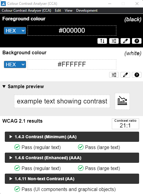
Focusing on the social links visible in the header of this website we can see that they pass the tests for AA large text as well as the test for UI components and graphical objects.

Color Contrast Analyzer showing sufficient contrast between UI elements and background.
As you can see, very slight differences in contrast can result in a pass turning into a fail:
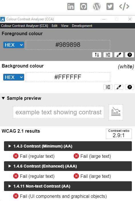
Color Contrast Analyzer showing insufficient contrast between UI elements and background.
Meeting accessibility contrast doesn’t necessarily mean drastic changes to the visual appearance of your website.
- paragraph text should meet WCAG AA regular text
- Headers should meet WCAG AA large text
- Image based icons and text based icons (such as the FontAwesome icons used in the header) should meet UI components and graphical objects
Skip buttons
Try navigating websites without using your mouse, only using tab to move around the page. Every time you click a link and navigate to another page you’d have to tab through the page header and navigation to reach the content you are interested in. A skip button is a simple anchor button that links to certain sections of the page, such as the content or sidebar.
<a href="#content" title="Skip to the main page content">
    Skip to content
</a>
As you can see from the example above, a skip button is no more than a standard link that points to the ID of an element on the page. Clicking this link moves the tab focus to the first element within this container.
Ideally we wouldn’t want a skip buttons to be visible all the time as they would disrupt the flow of the page. Some CSS styling can help with this but a skip button must never use “display: none” or “visibility: hidden” as this would result in the button being removed from the tab index.
Give the skip button a class to allow custom CSS rules to be defined.
<a href="#content" class="skip-button" title="Skip to the main page content">
    Skip to content
</a>
With CSS we can move this button off the visible page until it is in focus, at which point we want to display it on the page.
.skip-button {
    position: fixed;
    top: 20px;
    left: - 1000px; /* Moves the element off the visible page to the left */
    display: block;
    width: 100px;
}

.skip-button:focus {
    left: calc(50% - 50px); /* Moves the element to be horrizontally centered */
}
Try tabbing through this page, you will find hidden skip buttons for main content, sidebar and footer.
Landmarks
Landmarks help those who use screen readers to understand where on the page they are. A landmark is added by including a “role” attribute on a container element.
Some common landmarks are:
- heading (page and section headers)
- main (page content continer)
- article (article within a page)
- navigation (navigation container)
- complementary (sidebars and additional content)
- alert (success and error messages displayed inline)
- contentinfo (additional information regarding contents, such as copyright notices
For a full list of landmarks visit Mozilla’s Developer roles page.
Adding a role is as simple as adding any other attribute such as a title or alt tag. Adding `role=”navigation”` is all that is required to create a navigation landmark.
<div role="navigation">
    <a href="#">Link 1</a>
    <a href="#">Link 2</a>
    <a href="#">Link 3</a>
</div>
Aria labels
An Aria label is a complementary attribute similar to and image alt tag. When a screen reader reaches a section with an Aria label, additional text is read aloud to the end user aiding in their navigation of the page. Extending upon the example used above (Landmarks), we can describe the navigation section as a list of social network links; such as those in the header of this page. This is as simple as adding an attribute for “aria-label”.
<div role="navigation" aria-label="Social links">
    <a href="#">Link 1</a>
    <a href="#">Link 2</a>
    <a href="#">Link 3</a>
</div>
Aria live
Aria live are areas of the page which can be updated on the fly, such as notifications that are loaded via AJAX without reloading the page. An Aria live container should have a role set to “alert” and Aria live set to “notice”. When the content in this container is changed a screen reader will go directly to this section and read the content within it.
<div role="alert" aria-live="notice">
    <!-- Ajax loaded notices will be placed here -->
<div>
200% zoom
For end users with limited vision, every page should reneder correctly at 200% zoom on a “standard size” monitor. Thankfully with the advent of responsive design this is becoming less of a problem. Some less responsive designs will render important elements off the page at 200% zoom.
Unfortunately this is a section without a clearly defined resolution as every site is different in this respect. With some testing and updates this goal should be easily reached.
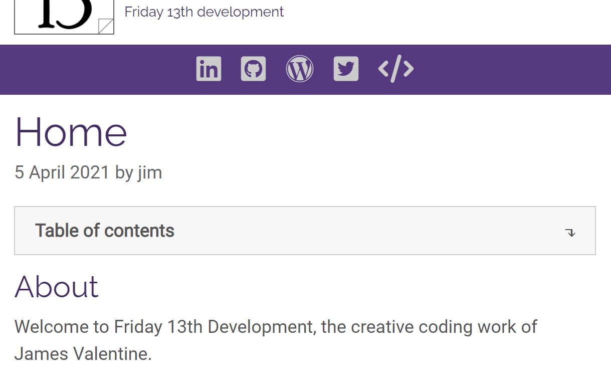
A preview of the homepage of f13.dev at 200% zoom.
Conclusion
This is not a comprehensive guide to accessibility, nor am I a professional on the subject.
Hopefully the information provided in this post helps to improve your web development for a more accessible internet. If there is anything you feel should be included in this list, please leave a comment below.
No comments on Web accessibility: Improving the web for all